The brand,
from the first
mark to the
last hoarding.
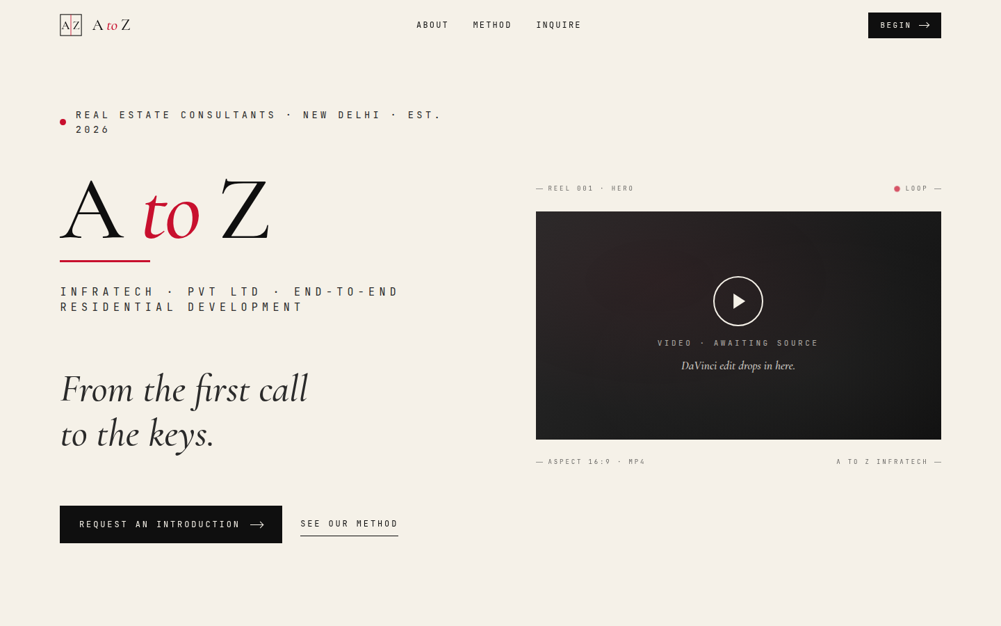
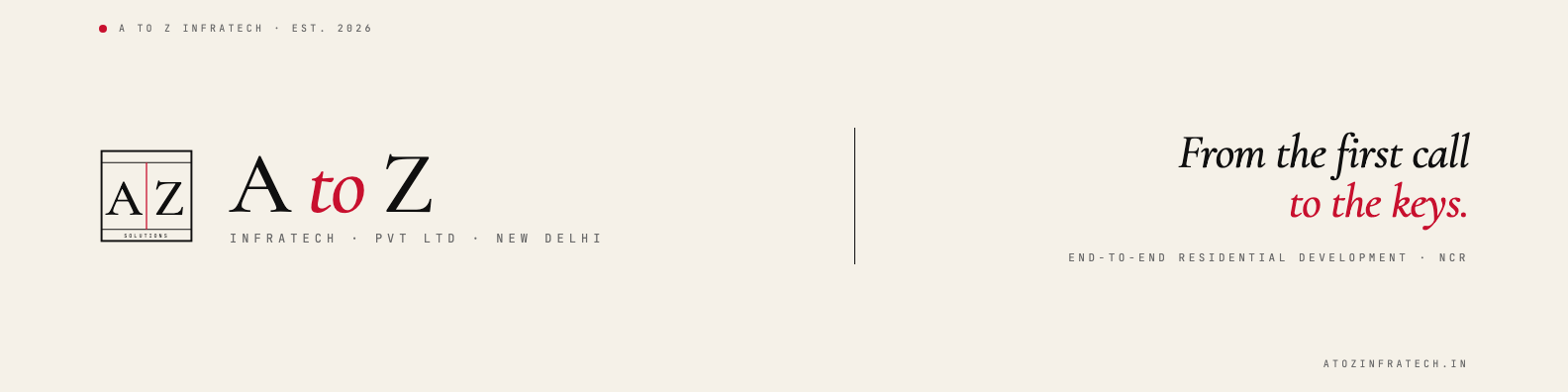
From the first call to the keys.
Everything we built to establish A to Z Infratech's identity from the ground up — the mark, the colour, the type, the website, the stationery, and the signage that goes up on site. One locked system.
Consultants first.
Brokers second.
A to Z Infratech is an end-to-end real estate consultancy for residential development — based in New Delhi, working with developers across the NCR. The positioning is deliberate and the identity carries it: research-first, not architecture-first.
Most consultants begin with bricks. This brand begins with proof — six weeks of buyer and market research before a single architectural line is drawn. The whole system is built to feel like a firm you book by appointment, not a broker you find on a hoarding.
So the identity is quiet and exact: an architectural monogram, a single disciplined accent of signal red, an editorial serif, and a mono voice for the fine print. Authority without noise.
“From the first call to the keys.”
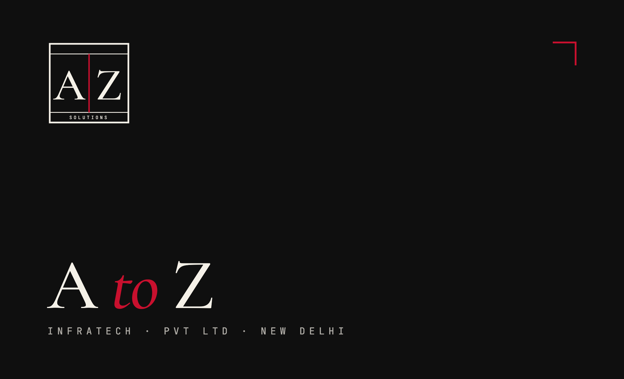
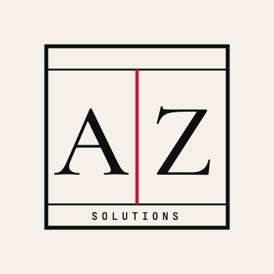
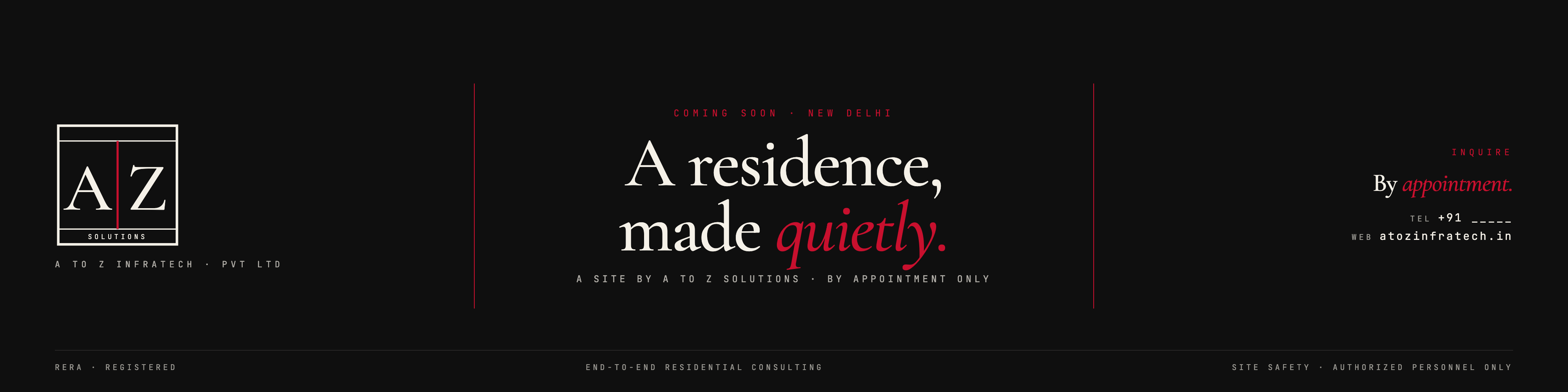
The mark.
A square monogram — an architectural frame with “A | Z” split by a signal-red vertical axis, anchored by a SOLUTIONS plinth in the bottom strip. The plinth is what locks this version. Delivered as SVG plus PNG at 512 / 1024 / 2048 px.
Colour system.
Ink and cream do the work; signal red is the discipline. Use red only for the italic “to”, the mark’s axis, CTAs, and one accent per section — never as a body or surface colour.
Type system.
Three families, each with one job. An editorial serif for display, a quiet sans for body, a precise mono for the fine print.
to the keys.
Research · Architecture · Identity · Launch · Sales
By appointment · Confidential
Six stages. One team.
The identity exists to carry the method — research-first, end-to-end, from the first call to the keys.
Down to 16 pixels.
Derived from the simplified mark at small sizes and the monogram at larger sizes — the SOLUTIONS plinth drops out below favicon scale. Full set: browser, iOS, Android, PWA, Safari pinned-tab.
 96
96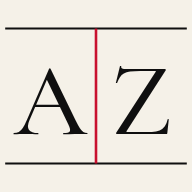 Android 192
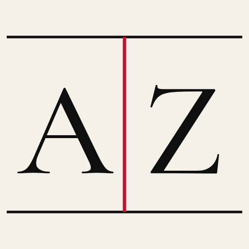 PWA 512
The site, live.
A single-page, cinematic site — brand intro, hero showreel, a research-led method timeline, and an appointment-only inquiry form. Built and hosted by us, live on the real domain.

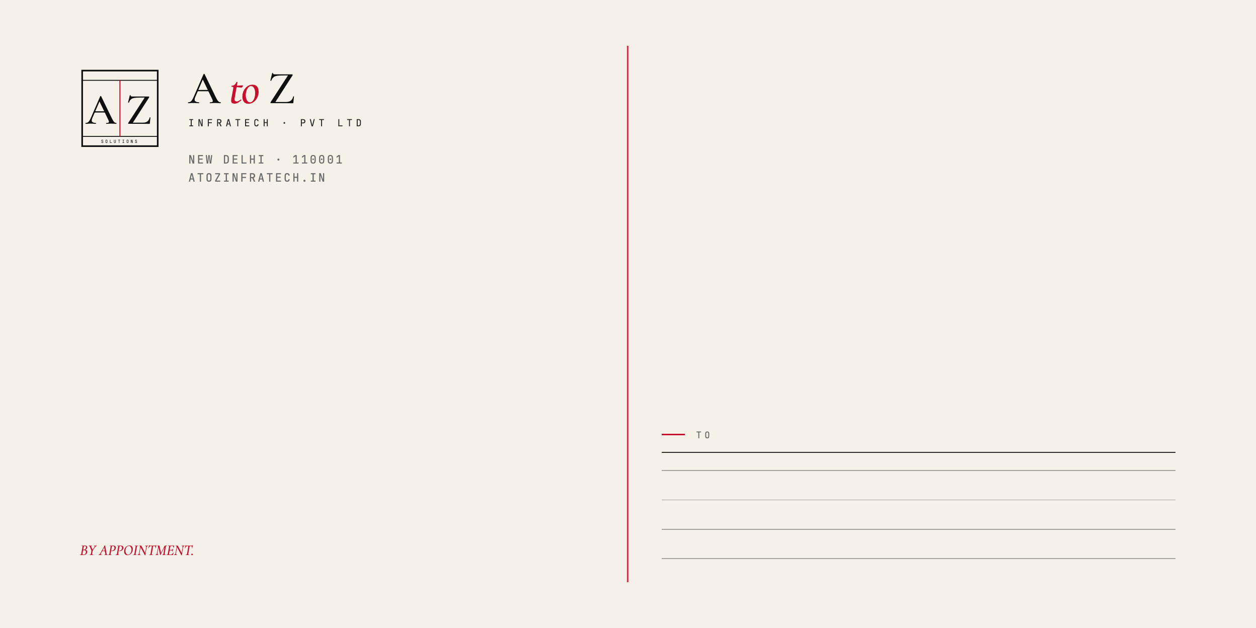
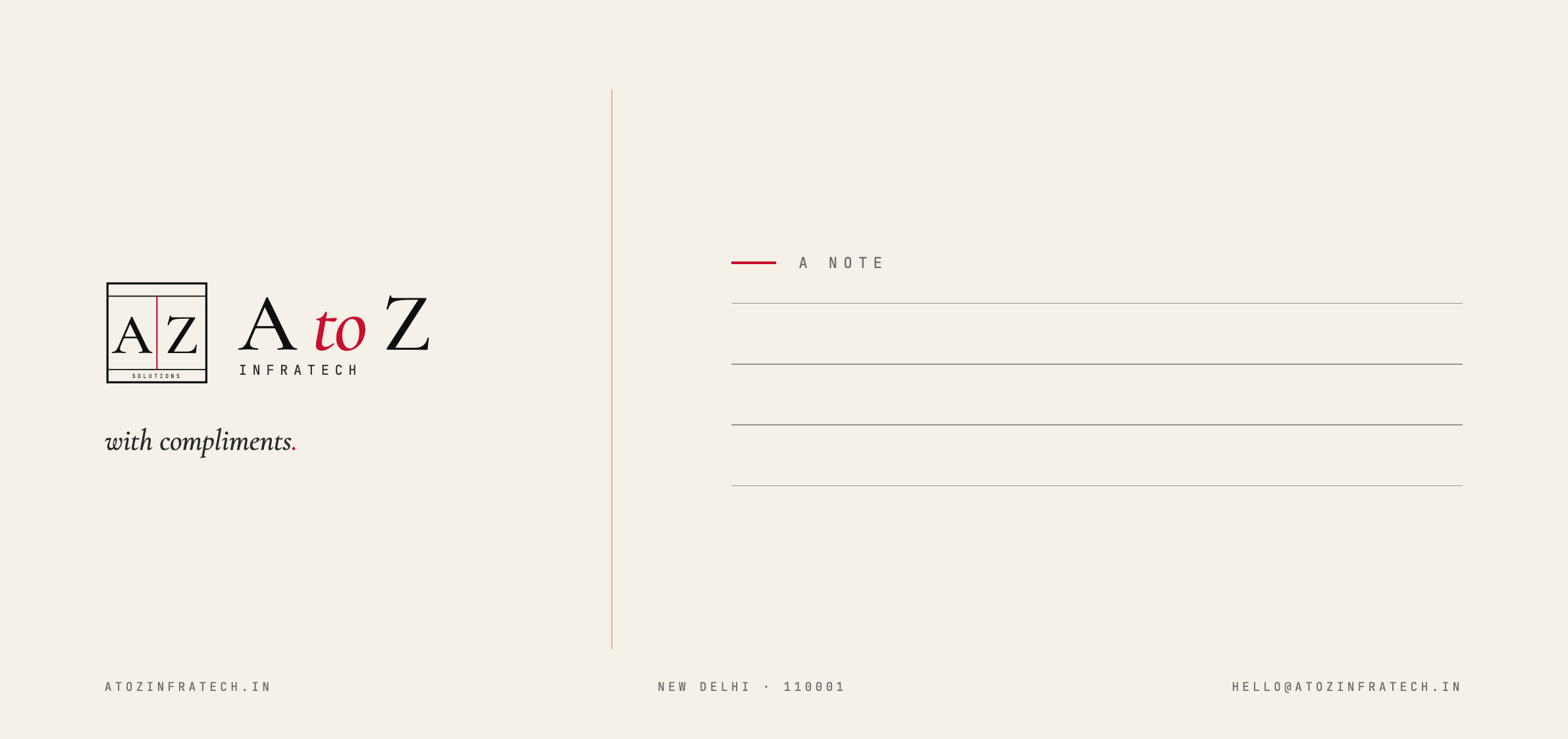
Print-ready identity.
Every piece delivered as PNG proof + print-ready PDF, with editable HTML source. Business card, letterhead, envelope, compliment slip, and a copy-paste email signature.


Profiles & banners.
Sized exactly for each platform — drop straight into LinkedIn, WhatsApp Business, and marketing email.


Where the brand goes up.
Real-estate-specific signage — the site office signboard and the project barricading panel. Proxy renders for vendor handoff.

The investor & client deck.
The full pitch in the brand system — narrative, method, and the case for research-first development. Delivered as PDF, PPTX, and a browser-based HTML presentation.
View the deck (PDF)One locked system —
from the first call to the keys.
Eleven asset families, one identity. Built from scratch to establish A to Z Infratech as a firm you book by appointment — research-first, end-to-end, residential development across the NCR.
The link preview.
One piece of artwork, sized for every platform — so every shared link carries the brand.